
Principal Investigator:
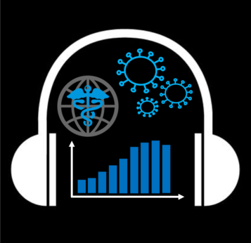
Giovanni FuscoCOVID-19 pandemic data compatible with screen readers are available at covid.ski.org
So much of the conversation around the COVID-19 pandemic has been about trends: curves and how to flatten them, models, exponential growth, etc.
Most of the graphs and plots commonly found online are not designed having blind users in mind, they are practically invisible to screen reader software.
I’ve created this website to make the pandemic data sourced by Johns Hopkins University available to people with visual impairments. The information is presented to screen reader users through a textual overview of the data and by using sonification. In its simplest form, sonification consists of mapping a range of values into a range of audible frequencies. If you’re curious and want to know what all of this is about, just check it out here: https://covid.ski.org
Projects
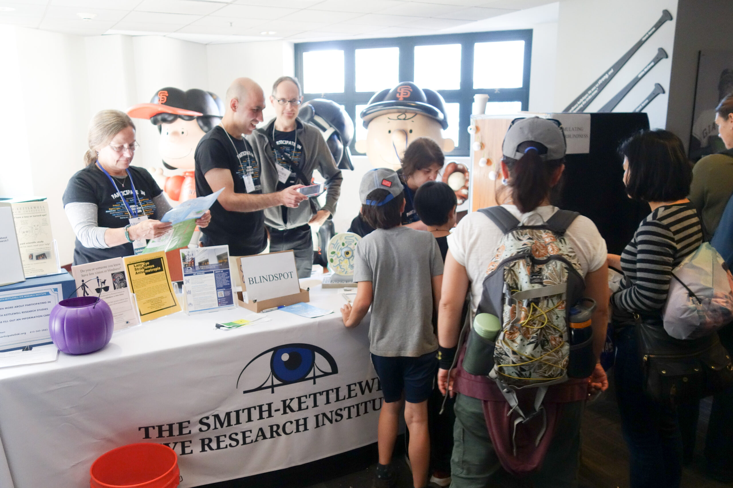
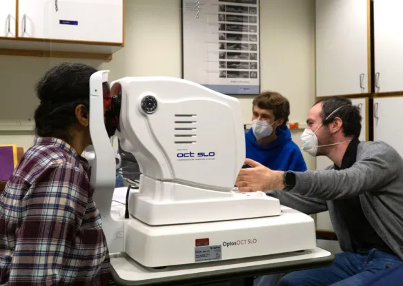
Outreach at Smith-Kettlewell
Centers
 Rehabilitation Engineering Research CenterThe Center's research goal is to develop and apply new scientific knowledge and practical, cost-effective devices to better understand and address the real-world problems of blind, visually impaired, and deaf-blind...
Fundings
Get Involved
If you are interested in vision science or want to learn more about low vision and blindness, there are many opportunities to get involved at The Smith-Kettlewell Eye Research Institute.